process_map(
  log = patients,
  type = frequency(value = c("absolute"))
)Process Discovery Techniques
Process analytics
R
This post will go through examples of some of the most common process analytics techniques for process discovery.
An artificial eventlog named patients will be used for the illustrations. (This dataset is available in eventdataR package, which is a part of the bupaverse package family.)
Process maps and trace explorers are the two alternatives for the initial discovery. They help the user with initial discovery of how a process flow looks like.
Process Maps
Process maps are used to visualize the activities in the process in the form of a flow and to display the various statistics we are interested in in this flow.
Example 1
The above process map example shows the number of activities passing through the nodes and edges. But that’s not all. A major advantage of using process_map is that it gives the user the flexibility to adjust the measurements shown for the nodes and edges
Below are some other useful examples with different measurements for the nodes and edges.
Example 2
process_map(
  log = patients,
  type_nodes = frequency(value = c("absolute")),
  type_edges = performance(FUN = mean, units = c("hours"))
    )
Different from the previous process map, this time the values on the edges represent the mean performance time between activities, measured in hours. This indicates the average time it takes to transition from one activity to the next.
Example 3
process_map(log = patients,
            type = frequency(value = c("relative")))
The values inside the nodes expresses how frequently each activity occurs in the process as a percentage.
And the values on the edges expresses how frequently the subsequent activity occurs after a given activity as a percentage.
Trace Explorer
The trace explorer, compared to process maps, gives a more compact and summarized view of the activity patterns followed by the cases.
The consecutive activity pattern for a case (for this dataset, the patients are the cases) is called trace.
patients %>%
  trace_explorer(coverage=1,
                 coverage_labels = c("absolute", "relative", "cumulative"))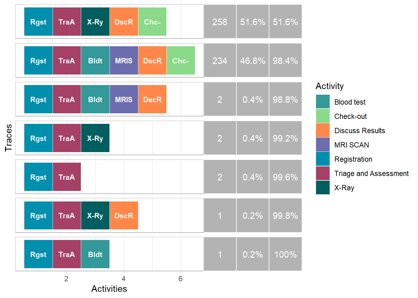
Each horizontal line represents a trace. And the gray-filled columns on the right respectively show the following:
- the number of cases that followed this trace
- the % of cases that followed this trace
- the cumulative % of cases that followed this trace and previous traces
The process map and trace explorer techniques, as seen, offer a quick understanding of a process.
Thanks for reading.