Employee Retention Analysis Using Survival Modeling in R (1/2)
HR analytics
Statistics
R
Published
October 12, 2025
Estimating a time to an event
Starting with the most basic distinguishing feature that explains the need to use survival modeling… When estimating the average time to an event, a common mistake is to calculate using only the cases where the event has occurred. However, analyzing only the data of occurred events leads to biased results. Survival analysis overcomes this by incorporating information from both events that have occurred (uncensored) and events that have not occurred (censored), resulting in a more precise and reliable analysis.
Some other applications of survival analysis include customer loss (aka churn) analysis, product lifespan analysis, insurance risk assessment, and evaluating medical treatment outcomes.
The application in this post will cover a use case from the HR domain using the fictitious IBM HR Analytics Attrition Dataset created by IBM data scientists.
Loading the required packages and data
library(tidyverse)library(knitr)library(skimr)library(survival)library(survminer)library(data.table)df <-fread("WA_Fn-UseC_-HR-Employee-Attrition.csv")source("custom_themes.R") # import pre-built custom themeskable(head(df)) # the kable() function prints the head of the data in a clear format
Age
Attrition
BusinessTravel
DailyRate
Department
DistanceFromHome
Education
EducationField
EmployeeCount
EmployeeNumber
EnvironmentSatisfaction
Gender
HourlyRate
JobInvolvement
JobLevel
JobRole
JobSatisfaction
MaritalStatus
MonthlyIncome
MonthlyRate
NumCompaniesWorked
Over18
OverTime
PercentSalaryHike
PerformanceRating
RelationshipSatisfaction
StandardHours
StockOptionLevel
TotalWorkingYears
TrainingTimesLastYear
WorkLifeBalance
YearsAtCompany
YearsInCurrentRole
YearsSinceLastPromotion
YearsWithCurrManager
41
Yes
Travel_Rarely
1102
Sales
1
2
Life Sciences
1
1
2
Female
94
3
2
Sales Executive
4
Single
5993
19479
8
Y
Yes
11
3
1
80
0
8
0
1
6
4
0
5
49
No
Travel_Frequently
279
Research & Development
8
1
Life Sciences
1
2
3
Male
61
2
2
Research Scientist
2
Married
5130
24907
1
Y
No
23
4
4
80
1
10
3
3
10
7
1
7
37
Yes
Travel_Rarely
1373
Research & Development
2
2
Other
1
4
4
Male
92
2
1
Laboratory Technician
3
Single
2090
2396
6
Y
Yes
15
3
2
80
0
7
3
3
0
0
0
0
33
No
Travel_Frequently
1392
Research & Development
3
4
Life Sciences
1
5
4
Female
56
3
1
Research Scientist
3
Married
2909
23159
1
Y
Yes
11
3
3
80
0
8
3
3
8
7
3
0
27
No
Travel_Rarely
591
Research & Development
2
1
Medical
1
7
1
Male
40
3
1
Laboratory Technician
2
Married
3468
16632
9
Y
No
12
3
4
80
1
6
3
3
2
2
2
2
32
No
Travel_Frequently
1005
Research & Development
2
2
Life Sciences
1
8
4
Male
79
3
1
Laboratory Technician
4
Single
3068
11864
0
Y
No
13
3
3
80
0
8
2
2
7
7
3
6
Data quality checks
There are 1470 observations and 35 variables in the dataset, and none of the variables has a missing value.
NoteShow the data summary
skim_tables <-partition(skim(df)) # one table per variable type, without skimr's console headerfor (type innames(skim_tables)) {print(kable(skim_tables[[type]], caption =paste("Variable type:", type), digits =2))}
Variable type: character
skim_variable
n_missing
complete_rate
min
max
empty
n_unique
whitespace
Attrition
0
1
2
3
0
2
0
BusinessTravel
0
1
10
17
0
3
0
Department
0
1
5
22
0
3
0
EducationField
0
1
5
16
0
6
0
Gender
0
1
4
6
0
2
0
JobRole
0
1
7
25
0
9
0
MaritalStatus
0
1
6
8
0
3
0
Over18
0
1
1
1
0
1
0
OverTime
0
1
2
3
0
2
0
Variable type: numeric
skim_variable
n_missing
complete_rate
mean
sd
p0
p25
p50
p75
p100
hist
Age
0
1
36.92
9.14
18
30.00
36.0
43.00
60
▂▇▇▃▂
DailyRate
0
1
802.49
403.51
102
465.00
802.0
1157.00
1499
▇▇▇▇▇
DistanceFromHome
0
1
9.19
8.11
1
2.00
7.0
14.00
29
▇▅▂▂▂
Education
0
1
2.91
1.02
1
2.00
3.0
4.00
5
▂▃▇▆▁
EmployeeCount
0
1
1.00
0.00
1
1.00
1.0
1.00
1
▁▁▇▁▁
EmployeeNumber
0
1
1024.87
602.02
1
491.25
1020.5
1555.75
2068
▇▇▇▇▇
EnvironmentSatisfaction
0
1
2.72
1.09
1
2.00
3.0
4.00
4
▅▅▁▇▇
HourlyRate
0
1
65.89
20.33
30
48.00
66.0
83.75
100
▇▇▇▇▇
JobInvolvement
0
1
2.73
0.71
1
2.00
3.0
3.00
4
▁▃▁▇▁
JobLevel
0
1
2.06
1.11
1
1.00
2.0
3.00
5
▇▇▃▂▁
JobSatisfaction
0
1
2.73
1.10
1
2.00
3.0
4.00
4
▅▅▁▇▇
MonthlyIncome
0
1
6502.93
4707.96
1009
2911.00
4919.0
8379.00
19999
▇▅▂▁▂
MonthlyRate
0
1
14313.10
7117.79
2094
8047.00
14235.5
20461.50
26999
▇▇▇▇▇
NumCompaniesWorked
0
1
2.69
2.50
0
1.00
2.0
4.00
9
▇▃▂▂▁
PercentSalaryHike
0
1
15.21
3.66
11
12.00
14.0
18.00
25
▇▅▃▂▁
PerformanceRating
0
1
3.15
0.36
3
3.00
3.0
3.00
4
▇▁▁▁▂
RelationshipSatisfaction
0
1
2.71
1.08
1
2.00
3.0
4.00
4
▅▅▁▇▇
StandardHours
0
1
80.00
0.00
80
80.00
80.0
80.00
80
▁▁▇▁▁
StockOptionLevel
0
1
0.79
0.85
0
0.00
1.0
1.00
3
▇▇▁▂▁
TotalWorkingYears
0
1
11.28
7.78
0
6.00
10.0
15.00
40
▇▇▂▁▁
TrainingTimesLastYear
0
1
2.80
1.29
0
2.00
3.0
3.00
6
▂▇▇▂▃
WorkLifeBalance
0
1
2.76
0.71
1
2.00
3.0
3.00
4
▁▃▁▇▂
YearsAtCompany
0
1
7.01
6.13
0
3.00
5.0
9.00
40
▇▂▁▁▁
YearsInCurrentRole
0
1
4.23
3.62
0
2.00
3.0
7.00
18
▇▃▂▁▁
YearsSinceLastPromotion
0
1
2.19
3.22
0
0.00
1.0
3.00
15
▇▁▁▁▁
YearsWithCurrManager
0
1
4.12
3.57
0
2.00
3.0
7.00
17
▇▂▅▁▁
Survival object creation
To start the analysis, a survival object needs to be created first. This is done via the Surv function.
The survival object includes time and censoring information. Numbers represent event duration, and the + symbol indicates the event did not occur during the observation time.
Fitting the Kaplan-Meier model
The Kaplan-Meier method is a non-parametric descriptive model, meaning that it does not rely on any assumptions about the distribution of the variables. It also uses the censored records in the calculation rather than discarding them.
km_fit <-survfit(s_obj ~1) # The 1 represents no grouping variable, so it's a single overall survival curve.# summary(km_fit) # the full summary of the fit; the next chunk keeps only the columns used below
Building a table including only the elements required for the rest of the application.
# names(summary(km_fit)) # lists the elements available to pick fromkm_fit_summary <-as.data.table(summary(km_fit)[c("time", "n.risk", "n.event", "n.censor", "surv", "std.err")])kable(km_fit_summary, digits =3)
time
n.risk
n.event
n.censor
surv
std.err
0
1470
16
28
0.989
0.003
1
1426
59
112
0.948
0.006
2
1255
27
100
0.928
0.007
3
1128
20
108
0.911
0.008
4
1000
19
91
0.894
0.009
5
890
21
175
0.873
0.009
6
694
9
67
0.862
0.010
7
618
11
79
0.846
0.011
8
528
9
71
0.832
0.012
9
448
8
74
0.817
0.013
10
366
18
102
0.777
0.015
11
246
2
30
0.770
0.016
13
200
2
36
0.763
0.016
14
176
2
16
0.754
0.017
15
158
1
19
0.749
0.018
16
138
1
11
0.744
0.019
17
126
1
8
0.738
0.019
18
117
1
12
0.732
0.020
19
104
1
10
0.725
0.021
20
93
1
26
0.717
0.022
21
66
1
13
0.706
0.024
22
52
1
14
0.692
0.028
23
37
1
1
0.674
0.033
24
35
1
5
0.654
0.037
31
16
1
15
0.614
0.053
32
13
1
2
0.566
0.066
33
10
1
4
0.510
0.080
40
1
1
4
0.000
NaN
The backbone of the survival analysis is the table above. Each row represents a year in which at least one employee left, indicating the number of employees still at risk at the start of that year (n.risk), those who left the organization (n.event), and the corresponding survival probability (surv). The table also includes the number of censored employees (n.censor), which refers to those who are still employed or whose employment status is unknown at that time point. Additionally, the std.err column shows the standard error of the survival probability: the wider it gets, the less the estimate in that row can be leaned on.
Visualizing the survival probabilities
Show the code
suv_x_lab <-"Years At Company"suv_y_lab <-"Probability of Continued Employment (%)\n"xmax <-max(df$YearsAtCompany)ggsurv_all <-ggsurvplot(fit = km_fit,data = df,title ="\n\nSurvival Probabilities (All Employees)",xlab = suv_x_lab,ylab = suv_y_lab,break.x.by=1,break.y.by=.1,surv.median.line =c("hv"),conf.int =FALSE,censor =FALSE,xlim =c(0, xmax),surv.scale ="percent",risk.table =TRUE,fontsize =3,risk.table.title ="Number of employees still at risk",risk.table.height =0.18,risk.table.y.text =FALSE,legend.title =element_blank(),risk.table.col ="#808080",ggtheme = theme_survival,legend ="none" )ggsurv_all$table <- ggsurv_all$table +theme(axis.title.x =element_blank())print(ggsurv_all)
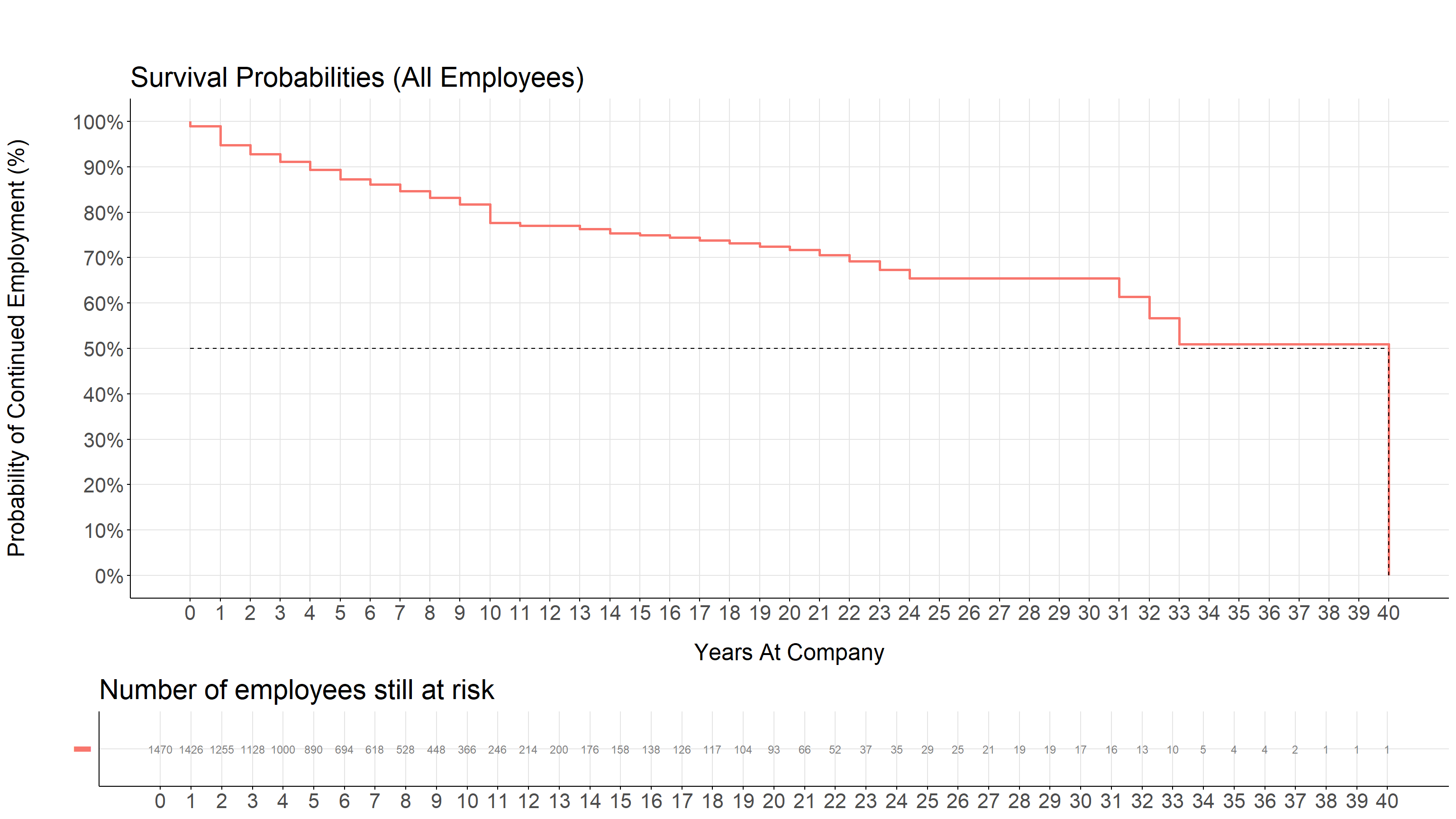
The interpretation of the visual begins with understanding the axes. The X-axis is the period (in years) over which the employees were observed. The Y-axis is the estimated probability that an employee is still at the company after the number of years shown on the X-axis. It does not mean that this share of the 1470 employees was still there in that year: employees whose records end while they are still employed leave the risk set without producing a drop, so every later step is calculated over the smaller group that remains under observation.
The drops on the line represent the employees who left the company. Each drop lowers the estimated probability, and how far it falls depends on how many employees were still at risk when it happened. The first drop sits at year 0: employees who left before completing a full year at the company.
By looking at the graph or km_fit_summary output, the probability of surviving (or remaining employed) at the end of 5 years is approximately 87.3%, while at the end of 10 years, it is around 77.7%. Pretty impressive!
The median survival time is the point at which the estimated probability of continued employment falls to 50%. It does not mean that half of the employees have left by then: in this dataset only 237 of the 1470 employees ever left, and the estimate still reaches 50% because it accounts for the employees whose records end while they are still employed. To determine this on a graph, examine the Y-axis for the survival probability and locate the 50% mark. Trace a horizontal line from this point to the X-axis. The intersection with the X-axis indicates the median survival time. To determine this from a table, find the first row where the survival probability reaches 0.5 or falls below it on the surv column. The corresponding time value is the median survival time, which is the 40th year in this dataset. However, something to pay attention to is the number of observations left after each year. When few observations are left, it is good to be careful with the conclusions drawn from that part of the data. In this example, the curve reaches 50% only in year 40, with a single employee left at risk; the closest earlier point, year 33, still sits at 51.0% with 10 observations. In this case, it is better to rely on the value from the latest year that includes 30 or more observations, which is the 65.4% recorded at year 24.
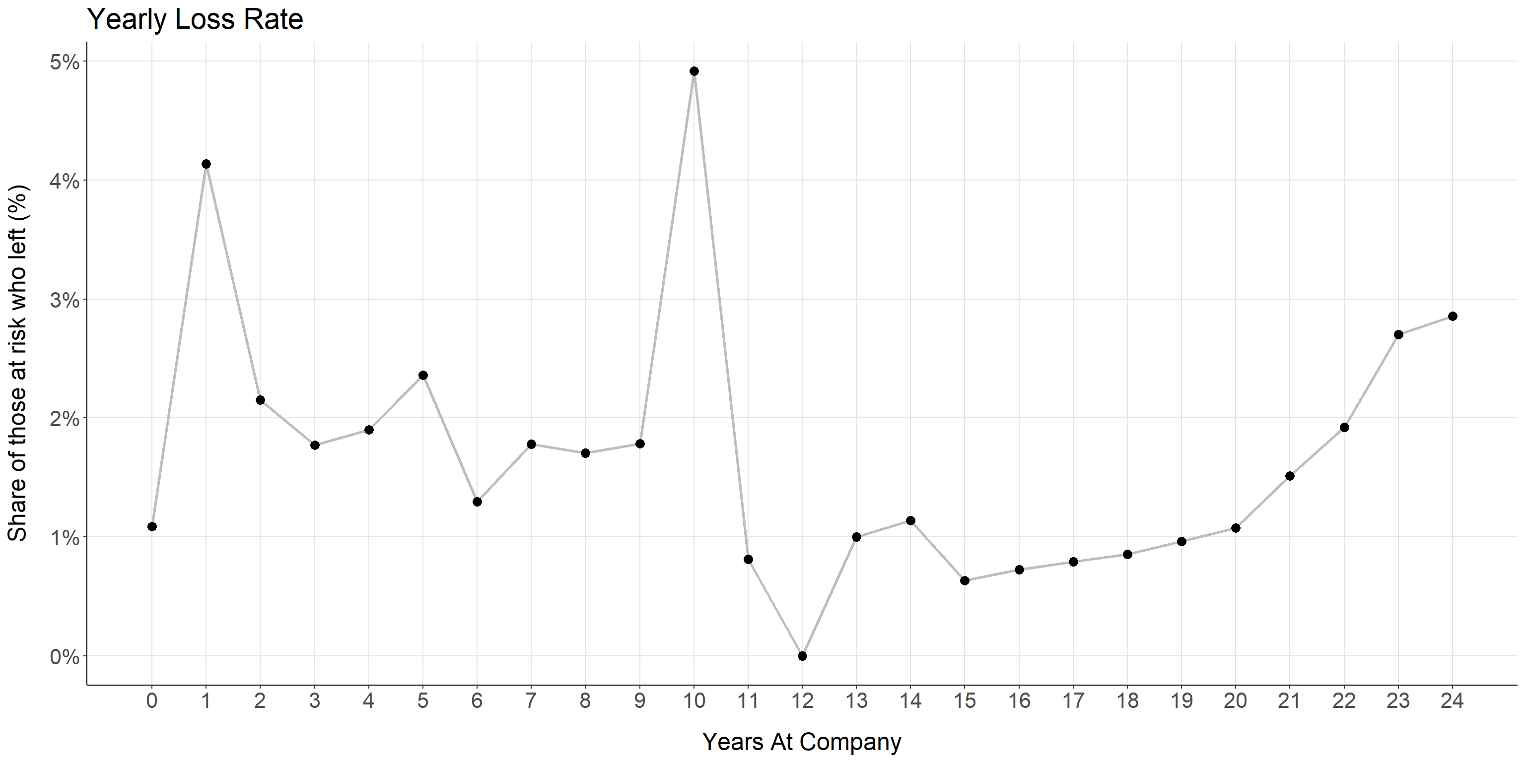
The years with the largest drops are worth examining on their own: they are the years in which the risk of leaving was highest. In this example, the largest drops among the years that still hold a meaningful number of observations are at the end of the 10th year (4.9% of those at risk) and the 1st year (4.1%). Larger drops appear at years 32, 33 and 40, but each of them rests on a handful of employees. If we were to visualize this…
Show the code
km_fit_summary %>%mutate(hazard = n.event/n.risk) %>%select(time, hazard) %>%filter(time <=24) %>%# years with no attrition are missing from the summary table; they are zeros, not gapscomplete(time =0:24, fill =list(hazard =0)) %>%ggplot(aes(x = time, y = hazard)) +geom_line(linewidth=1, color="grey") +geom_point(size=3) +labs(title ="Yearly Loss Rate",x ="Years At Company",y ="Share of those at risk who left (%)") + theme_survival +scale_x_continuous(breaks =seq(0, 24, 1)) +scale_y_continuous(labels = scales::percent)
The chart plots a conditional rate, known as the hazard: for each year, the share of the employees who were still at the company at the start of it and left during it. It is not the same as a drop in the survival curve, which compounds all the years before it. The chart stops at year 24, the last year that still holds 30 or more employees at risk, for the reason given above. Two peaks stand out: the first year, when the newest hires leave, and the tenth year, where roughly one in twenty of the employees who reached that point left the company. Years with no departures at all, such as year 12, sit at zero.
To be continued in the second part with a stratification example, which helps to highlight differences in survival rates among distinct subgroups…